What color for error messages for a form with a red background?
I have a big website with some forms.
There are four background-colours for the form components. One of them is pink/red.
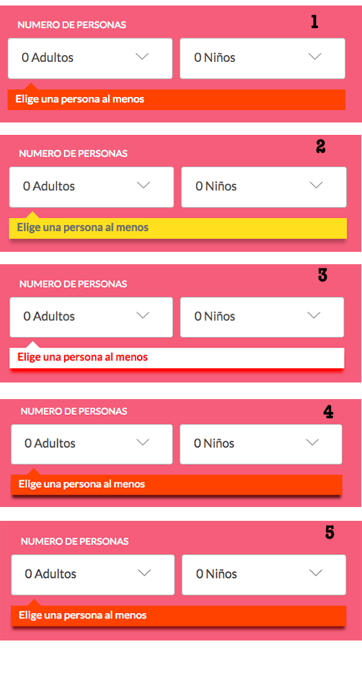
Here the image and the error message:
I can't change the form background-color, but I'm free to change the message style (background-color, text-color, etc.).
What do you think? I don't like it the red with white text. The error message is not very visible, because the background is red. I've been trying for a few days with other red styles, and some oranges, but it looks weird.
Blue or green backgrounds are really visibles, but it could be confusing. (success = green, error = red)
How can I improve this form?
I mean, I should change the error message and don't touch the select components.
Some options, inspired by your answers:
- 1 is current.
- 2 looks nice
- 3 weird
- 4 (darker) and 5 (lighter), similar, but the shadow is different
Thanks you all for the feedback!!


