
Visualize asset age
I have a roads table with an age column. There are approximately 3000 road records, with a maximum age of 70 years.
I would like to summarize this information for management-level employees in an auto-generated report.
What would be an effective method for visualizing asset age?
What I've tried:
At first glance, it looks like age is often visualized with a bar chart. There appears to be a couple ways to do it:
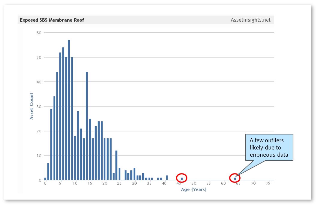
- Bars for each individual year. Example: Exposed SBS Membrane Roof
- Bars for ranges of years.
To my untrained eye, it seems like #1 would be good for data analysis purposes. The reader can spot outliers or years that are especially low or high. I don't think this is necessary for my purposes.
The objective is to effectively communicate a summary of information to management, so I think I might lean towards #2.