Improving button state by only changing colours

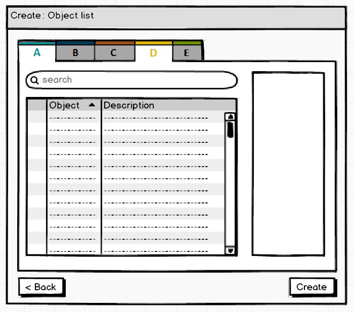
Background In short, the above 'Object list' increases in content when the different buttons at the top (A, B, C, D & E) are selected. These buttons look like tabs, but since several can be selected simultaneously (adding their respective content to the list) they behave more like toggle buttons. In the above image, buttons A & D currently generate the content in the 'Object list'.
Problem Users understand the functionality of the buttons, but report that they don't always know which buttons are (in)active. As a result they don't always understand which buttons generate the content in the 'Object list' below.
Question Since users had no problems with the actual functionality of the buttons I'm thinking of only improving the display state by use of colour, so (see image below):
- Active buttons are now lighter and inactive buttons are darker
- As a result the area connected below the active buttons is now lighter as well
- Active buttons have their letters in bold in their respective colour to illustrate a selected state
Am I heading in the right direction here by just using colours?