How to make text selectable in master/detail table view?
That's my first question in stackexchange!
We are designing a datatable view for scientistic users. They get this table after they input a bunch of filters and press search. The table is already quite big - 13 columns. However we know that often our users want to know more detailed information about each of rows. Each item(row) has quite a lot of additional information. As this is a research tool, our users want to find some interesting items from this table, and sometimes they just want to glance over table quickly and check detailed information of interesting items, or go one-by-one item and view detailed information for each of them. Also we know that our users might want to copy some text in that datatable in order to e.g. search that term on the internet. Also some rows are links to external websites with additional information.
So what we came up with:
Detailed information about an item is quite heavy information to squeeze in popup's on hovering some columns, so we decided to go for master detail pattern.
We could put the detailed view of each item just below the table, however we have content on the page above the table, so it might be not so easy for users to keep everything aligned nicely in the screen. Therefore we decided to show detailed view on the side of table, while minimizing the table on demand.
So there are two modes basically:
Mode 1 - Full table mode:
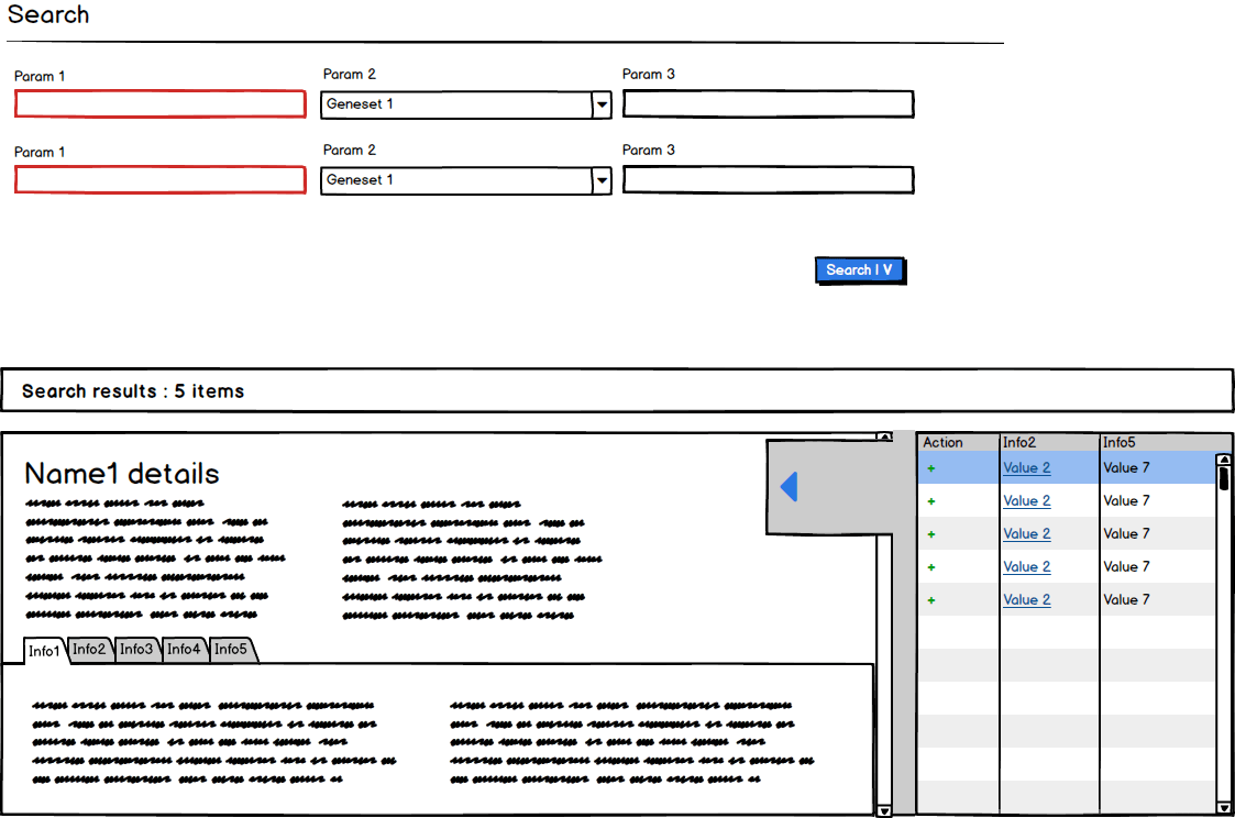
Mode 2 - Minimized table+detailed information mode:
Mode 1. Full table mode, where users can go over items basic information. Clicking on e.g. Name1 will open 1st item in Mode 2. Clicking Value4 of first item will also open 1st item in Mode 2, however it will also open a 2nd subtab "Info2" in the detailed view, instead of default subtab "Info1".
Mode 2. Minimized table+detailed information mode, activated clicking on the name cell of an item. Here users can see detailed information about an item. And there is an easy way to go back to detailed view (blue arrowed control). Minimized table provides some way for them to distinguish the items and go quickly over them one by one. To switch to another item, use click on Value 2 (alternative name to Name1 that makes sense in that context)
The problem we have is that only name + 2 other columns of the datatable that are opening the detailed information about an item. However it can be possible that users want to switch often between mode 1 and 2, so we are not sure it's very natural/fast way to do via clicking on some links inside rows.
We can't make the whole row clickable, because then it will be hard for our users to copy values from the table. Also we want both minimized and full tables work in the same way, therefore we would also need to have same kind of mechanism for switching items in detailed view. Clicking on a particular cell in the minimized table to change the item might be agains expectation of users regarding how master-detail view should work.
Somebody asked a similar question Is it worth making an exception to a single-click master/detail pattern? however in our case some cells have links to external websites and we don't think so far right click is a good way to go.
What would be most natural solution here?
Any input is welcomed!
Cheers, Max


