Focus the user on save screen, or still show preview?
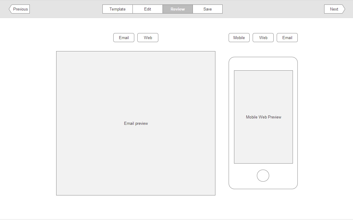
In my 3 screens below, I've shown the edit, review and save screens. These screens are part of a 4 stage process.
On the final screen (save), instead of the interface having a new screen, a sidebar slide animates in on the right. Is there any downside to breaking the paradigm and making the last screen a sidebar? Should the save screen be displayed on it's own?
My 2 concerns are that the user is not being focussed as hard on the task at hand by leaving the review on the screen, and also that if the user wants to go back to edit screen, and then skips back to save, is it disorienting for them?
Edit Screen
Review Screen
Save Screen


