
Button Icon States
I'm currently trying to determine how buttons with just icons as placeholders should be represented throughout our product.
Currently, each button is displayed as the representation on the right in this image.
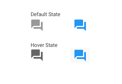
I'm curious if they shouldn't be colored or have an active much of a hover state like a button, and more like the left side where they are gray and then have a slightly darker hover state?
Not sure what the best use-case for this is. I'm also trying to stick to material design as well.